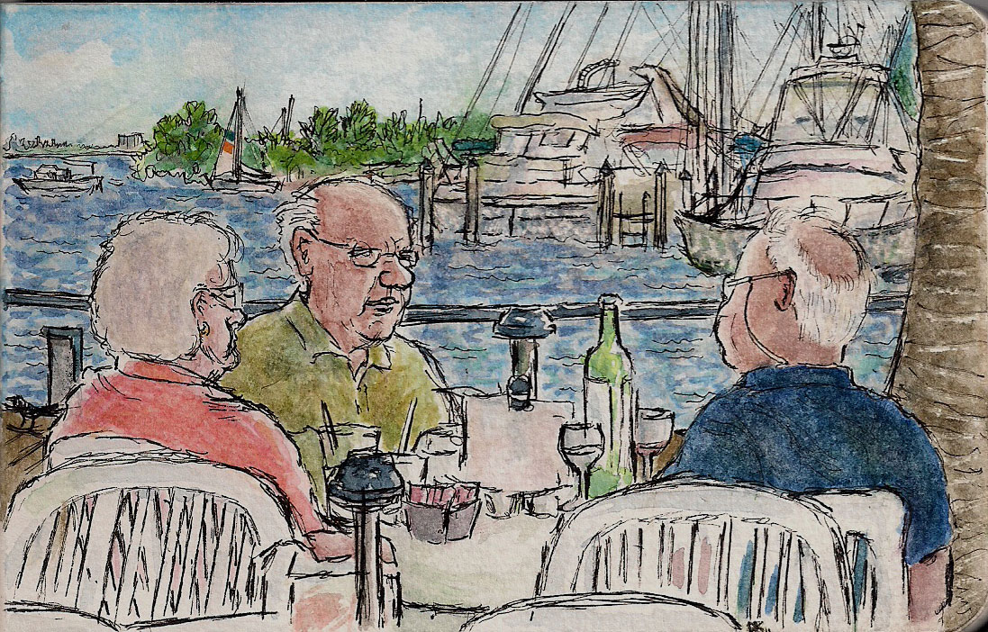
Showing posts with label drybrush. Show all posts

Sunday, July 17, 2011

Prior Incantato

Watercolor in moleskine, approx. 5" x 7"
I introduced my new possession with a slight trace of embarrassment and an abundance of barely suppressed pride.  "It's my only frivolous purchase," I said.

This is almost true. I rarely give in to buying whims. Even though I  had bought  it a week before, I  had no regrets, and I have no regrets now.  I am still thrilled with the purchase.

"What is it?" my friend asked.

I gestured with flourish to the spot on my shelf where the object has been displayed like a museum piece.

"A chopstick?" my friend asked.

I was horrified.

"Of course not," I said. "It's a wand!" A thin foot-long slightly tapered charcoal-colored wand, with intricate runes carved on the sides. Certainly not a chopstick; if anything, a fine baton.

I bought it at the Wizarding World of Harry Potter in Orlando. It is Sirius Black's wand which means it is a symbol of loyalty and sacrifice for all that is good.  But mostly, for me, it represents imagination, master storytelling, and unbridled creativity.  And magic, of course.

My friend doesn't have to understand.

I am lucky. I create a little magic every day. And each day it takes a new form.  I begin with a blank sheet of paper.

Sometimes I am amazed at what a sheet of paper or canvas can display.  Other times not so much.  To have the ability to wield a pen or a brush and create an image that wasn't there before:  that, I could tell my friend,  is magic.  I don't need a wand.  But it is nice to have the reminder on my shelf of so much that I admire, and of so much that inspires me.

The truth, of course, is that no wave of a wand will do. To imagine effectively we must exercise the mind. To create we must exercise the hand.

I have been nearly obsessed lately with the Helga watercolors by Andrew Wyeth.  Andrew Wyeth employed drybrush in many of his pictures, in which most of the moisture is squeezed out of the brush, to create his emotion-laden images.  I have read forums online in which watercolorists have been both baffled and amazed by his results.  [Wyeth's wand:  Stupefy! (You can see a list of Harry Potter spells here.)] 

At least a year ago I found an article about his technique which you can read here.  I revisited it recently.  According to the article, part of how Andrew Wyeth described his process was this: "You weave the layers of dry brush over and within the broad washes of watercolor."

I hadn't caught it the first few times I read the article, but it made sense - he employed both washes and drybrush.  So as a study in my moleskine above, I started the face of the woman above as a wash, almost as I always would.  Only then did I employ the drybrush technique.  For me it was a very slow process - a gradual build up of transparent layers, almost like sculpting, and I was amazed at how the areas in the face began to acquire depth.  This was very different than using the other watercolor methods.

I reached a point where I felt the entire face needed more color, and again thought of the above quote.  Andrew Wyeth did not simply lay a wash and then apply drybrush, but employed a weaving of the two.  So I laid a wash over what I had done, unsure whether that would unsettle everything.  And it worked!  And then resumed the drybrush.  So this was a successful experiment I think.

I don't know that I have done anything like what Andrew Wyeth has done in technique in that I have never been able to examine an original Wyeth piece (I am a mere fledgling artist, self-taught/self-teaching, and even were I to stumble somewhere close, I am nowhere approaching the quality of his work, of course.) One great thing about Andrew Wyeth was that he did not feel limited by any one watercolor technique and felt that he could use several in one piece.  So I tried to do the same.

Except for some initial trials, I used the watercolor medium, gum arabic, for the first time in this picture - and only in the hair.  The description on the bottle says gum arabic "increases brilliance, glosses and transparency of water colours.  Controls spread of wet on wet.  Reduces staining."  I bought the gum arabic because I have not always been satisfied with the vibrancy of the colors.  I do not see that the colors are especially more vibrant than elsewhere on the page.  The texture of the paint did seem to change, and I did note that if water was placed on the hair after it dried, then the hair would vanish [Evanesco!], so staining was definitely reduced. 

It is interesting that in drawing any person, problems can result, sometimes in the most surprising places.  In this one I had a problem with the shape of the shoulders of all things - I mean who ever thinks about the shoulders?  (Except perhaps Henry Raleigh whom you can see in this post of the excellent "Illustration Art" blog, and whose work so impressed me that I could not draw for two days).  It just shows that you can't ignore any part of the body, and must learn - eventually - to control each and every part.  [Imperio!]

There is no substitute for practice. Only then will I learn.

So join me, won't you? Pick up your brush, your pencil, your pen, or whatever it is that you use, and repeat after me:  Wingardium Leviosa! (Make sure your emphasis is on the "o".)  And may all of your creative efforts hereafter rise to new heights.

Sunday, June 26, 2011

Left-brain/Right-brain (Or Much Ado About Nothing)

Ink and watercolor in moleskine
Warning:  Mind at work.  Use due care as you step into my mind as the left-brain and right-brain are hard at work in developing the above page.

Left-brain:   It's a crowded room, and there are lot's of people.  It's a good chance to sketch.
Right-brain:  Must draw!  Must draw!  Pen.  Pen. Where pen?!  Thank God.  Pen here.  Draw!
Left-brain:   Now who should I draw?  Maybe that elderly woman.  She doesn't seem to moving around too much, and she can't see me from this angle.
Right-brain:    Face. What a face!  Angst!  Such angst!  Circles. Circles.  Round and round.  Pen.  Pen!
Left-brain:  Let's see, the nose is at about a 10:00 angle, and it is about so long..
Right-brain:  Sliding Pen, curves..curves!  The face.  Here. I feel - the line here! Ooooh!

Then, after a similar left/right collaboration when drawing a man onto the page:

Left brain:  I want a whole statement.  Not just two unrelated faces on a page.  I think I'll draw a line to connect them - kind of like what Barbara Weeks does in her sketchbook here.  Now to color the faces:  I think I am beginning to get a glimmer of what Andrew Wyeth does with his skin tones.  It is not just drybrush, but an initial wash plus drybrush, or perhaps multiple washes alternated with drybrush.  I've got to try that.  It's like when I completed the figures in this page, I applied drybrush in various places over wash, and I like the effect:

Ink and watercolor in moleskine
Left brain:  I need to experiment with this drybrush over wash, to see if I can mold contours of a face.  Let's see - here's a drawing in my moleskine I don't like so much.
Right Brain:  Brush.  Here!  More here!  Ooh!!  Over here!
Left brain:  How each layer shows through!  I think I forgot as I did this where the light source was, but a successful experiment nonetheless!  Now let's try it on this other page!

Back to the page with the man and the woman, and the right and left brain collaborate on applying colors to the faces.  But something doesn't seem right about the background:

Right brain [viewing the painted faces on the white page background connected by a line]:  Boring.  Emotionless. Need Color.  Color!!   [Proceeds to put color all over the page recklessly, and with abandon.]

Left brain:  Hmmmm.  Don't like the way this one came out really.  I think I'll have to post this with the white page in the back.  I'm glad I scanned it.
[But left brain then shows the page to his Most Valuable Critic, an invaluable female whole brain, whose mouth says:  Nah, I don't like the colors - too pastelly.  I think grey would be better.]
Left brain:  Why not?  It'd be a neat experiment!  I can see if I can use different complimentary colors over all of the different colors for many different grey tones, and if that proves too unwieldy I can just spread Paynes Grey over everything - it's semi-transparent, colors should show through to some degree for interest.

Right brain [after Payne's grey is spread over everything]:  Whoa.  Somber.
Left brain:  It's amazing what a background will do.  White didn't do this.  Color didn't do this.  The grey has connected them.  They are family.  He has done something terrible.  He looks for foregiveness but she cannot forgive.  What he has done is irredeemable.
Right brain:  Yeah.. [Sigh].  What he said.

Where I stand today:

Left brain: Now to use a much larger pencil drawing of a woman's face to try this technique - wash first, then drybrush, then glazes perhaps, then more drybrush.  A larger drawing allows room for detail.  The absence of pen makes me rely entirely on painting.

[At first it looks horrible, but gradually, layer by layer it builds thanks to the intuition of the Right brain.  This method is slow!  But could it be working?]


The left brain is useful and the right brain is necessary, but the fingers are indispensable.  Because right now, the fingers are crossed.  We shall see..

"I am continuously seeking, trying out new ways.  It utterly absorbs me.  I am continually producing drawings, although most of them don't ever develop into anything because I get another idea of something that is better than that initial, sharp, idea." - Andrew Wyeth.

Both brains agree.  Or maybe you could say that both brains are of the same mind.  Hmmm.  Makes you think, doesn't it?

Thursday, February 25, 2010

Reasons Not to Post

Today is February 27th, and this is the longest gap between posts that I can remember. So, I'll follow it up with the longest post ever (in three parts) to overcome my posting withdrawal (and hopefully yours).

Then again, you can skip to Parts II and III - they're shorter, and fun. Or you can just look at the pictures. There are three - two drawings and one photo - around and beyond all those darn words.

PART I. THE PLANKTON SWALLOWED THE WHALE.


Despite the gap in posting, I haven't stopped drawing and painting. And my hunger to do art still exists. In fact, I am famished. This time, though, the meal was me.

Raena said recently that she is following my advice of a long time ago: quantity, not quality. But that's not the whole of the advice, exactly. At least I don't think so.

I told her of an anecdote in a great book, "Art & Fear", by David Bayles and Ted Orland, about a ceramics teacher that divided his class into two groups. One group was to be graded on the quantity of their work, and the other on the quality. On the last day of class he would weigh all of the pots of the quantity group to determine the grade. The quality group would only have to produce "one pot - albeit a perfect one - to get an 'A'."

Who made the best pots? The quantity group. They were learning from their mistakes each time, whereas the quality group, as the authors described it, "had little more to show for their efforts than grandiose theories and a pile of dead clay."

[If you're tingling with excitement right now because you love discussions like this, visit Katharine Cartwright's blog, who dishes this out virtually every day.]

So I, like Raena, have been following this example. I draw or paint in every spare moment. I have many things going. As Wil says, "when I'm sitting I'm drawing." But I don't believe that quality is ever far from any of our minds. I, for one, would like for each drawing or painting to be a masterpiece, but of course it won't be. And I'd like a nice easy upward linear transition to excellence, and it's not like that either.

I don't think the "quantity" potters would have learned from their mistakes if they were not also concerned with quality, do you?

I drew the above band in my new Moleskine at the Coconut Grove Arts Festival on a beautiful day a few weekends ago (my apologies to Diahn who's been weather-oppressed). I drew in pencil for a change. It was great fun. At one point a gentleman, who was videoing the event, panned his camera over my drawing. What a hoot!

Then came the painting. I worked in layers of light washes, building up the musicians, but the paper seemed to suck up each layer and seep the life right out of them. I even compared the book to my old Moleskine to see if the paper was the same. It was. I have no idea why the painting remained so light with successive washes. My color choices, perhaps. Maybe the colors were too diluted.

This was just a Moleskine page. One 3" x 5" page. But I was obsessed with getting it right. It was as though the plankton had swallowed the whale. I was going to finish.

Then I painted the vegetation in the sign behind them. Suddenly the color of the sign was so strong that it overpowered the musicians. So I had to dampen it back with a wet cotton ball and with some lifting with a brush, which, to my relief, worked. But then, of course, the page was insipid again.

This picture remained in its gangly adolescence during virtually the whole process. Finally when I began doing the boxes and shapes in the back, I was able to play a little with color and shapes - almost creating an abstract - and the little picture seemed to come together.

Then I went to scan it. And the scan changed the colors a bit (as they tend to do). And made the picture a bit more lively. The value contrasts were better. I liked the scan better than my art! And I began to think, I can change that, and I felt myself being sucked in once again. But then this post would never have been done, would it? So I'll probably try another time.

PART II. I AM A VULNERABLE GOD.


Sometimes art is frustrating, but that's okay. Because on the page, I am a god, though in an ancient Roman or Greek sense, I think - all-powerful, though vulnerable.

At the art festival, I drew this old guy in pencil. He was stretched out on the lawn in an odd position, reading the paper. He didn't look to comfortable to me, but eminently drawable. And he had a backpack at his feet, like a 20-year-old.

I painted him in drybrush. As I understand it, drybrush is done by thoroughly covering the brush with watercolor, and then squeezing the water out. This is my first attempt. It seems that with more pigment and less water, the colors are more vivid. Also it seems good for detail work. I think it would work well for details over watercolor washes as well.

Then I decided to paint a loose wash around him: the green grass below, and the blue sky above. Both washes came out fine, but I did not like the way I had shaped the curve of the sky above. I couldn't post that. But, of course, I am a god. So I made the sky into mountains. But the mountains also displeased me. I didn't want to post them. So I turned the mountains into a wall. And had to add a window. More delay, but that's okay. I am a god. On paper, anyway.

PART III. FRUSTRATION

If you are ever frustrated with your art this is what you can do: grab a square of toilet paper, and then draw on it - maybe the view from above of a person diving, or a fish, or something else suitable - and toss it in the toilet bowl just so, and then flush. This is - take my word for it - great fun.

Or you can just take a shadow shot, for Shadow Shot Sunday: