Showing posts with label drawing in public. Show all posts

Sunday, July 29, 2012

At the North Pole

Ink and watercolor in large moleskine
I am standing at the North Pole of art-making, and my compass is spinning out of control in each and every direction.

But, just as they say each December, it is magical here.

Which way to turn?  I have been exploring traditional watercolors because I want to understand the medium and hone my skills, and that is good.

I have also drilled a hole into the ice, and placed one big toe into the world of acrylics.  And I like it, although my toe is blue.

Then there is the world of ink and watercolors.  I sketch almost everywhere I go (though not each time) and my obsession, as always, is people.  The above sketch was made on a glorious day at the opening ceremonies of my nephew's little league.  I had the luxury of time to sit and sketch - a wonderful stretch of time.

Then there is my small moleskine filled from cover to cover with many more modest sketches.

I lost interest in coloring my ink drawings with watercolor.  Competely and utterly.  My compass had turned the other way.  So all of it has been left uncolored.

dip pen and brush with ink
Until now.  The needle has turned.  So I finished coloring the above drawing last week and more will come.

I also have the idea for a series of ink and watercolor figures.  The first is done, and you will see it soon.

And my exploration of both watercolor and acrylic is continuing.

The needle points other ways too.  I did this drawing of a girl from a photograph as a kind of experiment, using a pen dipped in a bottle of ink, and, for the hair, brush and ink.  I love the line I get from the dip pen - and brush and ink is a wonderful.  The possibilities are endless, I think.

Now, pardon me, my helpers have arrived - all of the muses that help me make my toys, these pictures, are leading me away with their little hands...

Saturday, January 22, 2011

Out and About


Sometimes in the field you see something unique to draw that is not really uncommon at all but represents a great swath of people.

You need only get out of the house - open the door a crack. Yes, a crack. And draw what you see.

If she only knew.

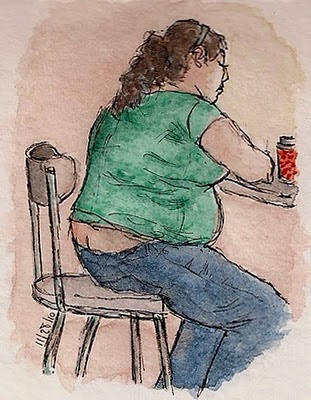
This was a quick sketch while I was sitting at a Target with my wife and son. I colored it yesterday.


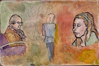
Here is a page from my Moleskine. Not untypical. Three opportunities to sketch. Three unwilling - or at least unwitting - subjects. I colored these yesterday as well, and then decided to try and unite them with a background (something new for me). In my mind they are three members of a family, or three characters in a story, and some drama is afoot. You might notice a fourth figure as well. The yellow is much more subtle than is shown; for some reason, the scanner magnifies the color's intensity.


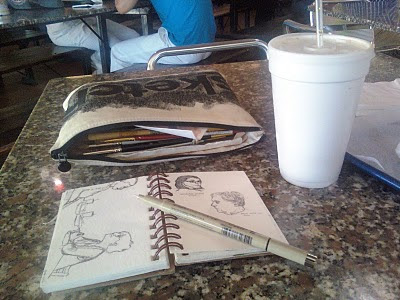
Some of you have asked what I carry around in order to sketch/paint in public. I will share this because you ask, not because I in any way believe that this is the way to do it. I have seen a great many other options in artists' blogs online.

My wife bought me a flexible 6" x 9-1/2" case at Barnes & Nobles that says "Sketch" on it. I like to think that it looks like one of those cases stuffed with money for a sizeable bank deposit. Only without the money. I have much more in the case than I ever use. I carry whatever pad I am drawing on separately, and usually keep my pens in my pocket. It's not that they wouldn't fit, but I never want to be caught anywhere without my pad and my pens.


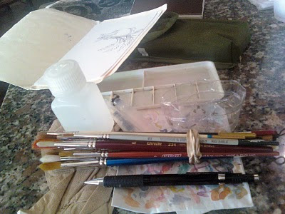
Here are all the supplies laid out on the table, more than I ever take out. Here are the extras: I have more brushes than I ever need. I figure you never know when you want a certain size, but the truth is that I never use more than 1 or 2 in a sitting, so it is sort of silly carting all of these around. I've just begun bringing a pencil or charcoal pencil with me. I worship pens so these are largely ignored. I have a waterbrush that I never use, and sometimes I have a cotton ball or gauze. Sometimes I carry pages of watercolor paper in a tiny manilla folder that I cut down to size.

Now, the essentials, aside from 1 or 2 brushes: There is my travel palette in a green carrying case I got at the Army-Navy store. I cut the bottom off of a water bottle that makes a nice flexible container for the water I dip the brush into. I have a flat tray for mixing that I bought for $1 and that I prefer to using the case itself (I have never used the case). I have a white piece of paper so I can test colors, a napkin or paper towel, and a watertight container with water in it. One great advantage is that I often sketch in eating establishments so water and napkins are plentiful and free.


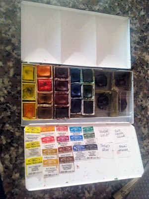
Here is my palette. For now, I use Winsor & Newton Artists' Watercolors, and the colors I take with me are: Cadmium Lemon, Transparent Yellow, New Gamboge, Winsor Orange, Cadmium Red, Yellow Ochre, Raw Sienna, Indian Red, Permanent Magenta, Burnt Sienna, Burnt Umber, Manganese Blue, Cobalt Blue, French Ultramarine, Viridian, Permanent Sap Green, Ivory Black (virtually never used), Winsor Violet (virtually never used), Payne's Gray, Rose Madder Genuine, and Brown Madder (Great for skin tones). I need a darker red.  [IMPORTANT UPDATE:  I have removed Rose Madder Genuine and Burnt Sienna from the palette because I have learned that these are fugitive colors.  I have replaced them with Permanent Rose and Perylene Maroon.]

I have this palette because the colors were among those recommended in the book Exploring Color by Nita Leland.

Most are half-pan, but after a discussion online about the fact that you can mix more with tube colors, I started buying tubes. So the pans on the right are filled with paint squeezed from tubes.


Happy sketching!

Wednesday, November 24, 2010

Return of the Floating Heads

Wilfred at Carving Paper says, "When I am sitting, I am sketching." I've sort of adopted that as my motto as well.

But last month I decided to sketch while walking at the Susan B. Komen Breast Cancer Walk, and this is the result.

I have always thought of the awareness ribbons as symbols for causes. I have come to understand, though, that behind each ribbon - whether for breast cancer, soldiers abroad, autism awareness, or something else - there is a whisper of pain and of fear, but also a defiant shout. I admire all those who stride forward in the face of the frightening unknown.

People differ in their experiences and their reactions to them, but they are remarkably similar as well, of course. I don't know if it is because of their exotic differences or common humanity, but observing people is interesting to me, and I am compelled to draw their faces. So here is a sample from last month's sketches, recently colored with watercolors, in my new Strathmore watercolor journal.


Faces appear to be my "default". When I am too busy, or tired, or just lazy, faces are what I draw. At the beginning of this blog (before my discovery of the wonders of watercolors), faces were all I drew. I called them "floating heads". (You can click on the images for larger views).


If you have ever tried to figure me out, psychoanalyze me, or have just been plain curious about who I am, I offer you this glimpse into my subconscious, also sketched in the Strathmore journal. This, then, is my "bar code".

So after studying it a bit, or scanning it in a reader, I ask you: are we the same, you and I, or different? Or maybe, just maybe, you'd rather not think about it.

Happy Thanksgiving!

Tuesday, August 24, 2010

Yeah!!


I did a two-page spread in my Moleskine. This one, folks, took a while. So long that I began wondering why on earth I would spend so much time on two pages of a Moleskine. ("Because!" I say defiantly.)

The front part was drawn in bits and pieces during several lunches at Qdoba in South Miami, except that the old man was snatched (kicking and screaming - and still he didn't wake up!) from Einstein's Bagels in Coral Gables, and the blond's legs were borrowed from another person in another restaurant altogether. This is because the blonde didn't cooperate and walked away before I was done drawing, inconveniently taking her legs with her! I had to find people sitting in the positions I needed to complete the drawing. More recently I decided to finish the sketch, adding the background scene and walkways. Everything, as usual for me, was done in pen on site. And this week I painted.

Since the two page spread doesn't display too well, I've split it up for you. (Of course you can always click on the pictures to see larger versions as well).

Rather than have broad fields of grey for the roads, I mixed the much more satisfying complimentary colors permanent magenta and permanent sap green. Even that would have been boring as a plain wash, so I added splashes of each color for interest.

I used pure colors rather than combinations for the front figures so they would stand out, and as always I try to be creative and a bit playful with color and to balance the colors throughout the picture.


I'm reading a great book on Georgia O'Keeffe by Britta Benke. I was surprised at how many of her thoughts about painting, and the thoughts of individuals who taught and influenced her, resonate with me even with regard to how I planned the humble spread above. For example, O'Keeffe said: "It is surprising to me to see how many people separate the objective from the abstract. Objective painting is not good painting unless it is good in the abstract sense. A hill or tree cannot make a good painting just because it is a hill or a tree. It is lines and colors put together so that they say something. For me that is the very basis of painting. The abstraction is often the most definite form for the intangible thing in myself that I can only clarify in paint."

To that I can only say, "YEAH!!"

Saturday, May 22, 2010

Fish Meets Girls, DZAN meets PAMO, & SSS...

I sketched these ladies at yet another restaurant, and showed them to Tough Critic No. 1, and Tough Critic No. 2.

Tough Critic number 1 said that I can't possibly post this picture, because the lady on the left looks just terrible. Most bothersome, she said, is the little curve I made on the poor woman's upper lip which she referred to as a Salvador Dali mustache.

She suggested a solution that I used some posts back, here at this post, i.e., the bag over the head. She also said that I had other alternatives as well: (1) I could turn her into a tree - some restaurants do have trees, you know, or (2) I could cut her out of the picture.

Tough Critic number 2, said that the picture looked fine, except for the lady on the left because she doesn't look right and has evil glasses. Most significantly, she looks like a parrotfish. For your convenience, I include the picture of a parrotfish, so that you can compare and decide for yourself.

I like and appreciate my Tough Critics, I learn from my Tough Critics, and sometimes I avoid embarrassing mistakes because of my Tough Critics. But I am posting this picture nonetheless. First, I am kind of proud of this sketch. The woman on the left kept moving her head, and that's the trouble in the field. Her Dali mustache was going to be a nostril! And it's waterproof ink, so what can I do? But I like the drawing overall, and am pleased with the composition. And maybe I'm losing it, but I don't think she's all that bad - prune-like sure, homely, shriveled, crabby yes - but I've seen folks like her. Maybe she's someone I wouldn't want to spend time with, but she's welcome in my sketch.

I also had fun with colors. I used different paints to achieve skin tones with each face. Now I'm forgetting (I should write these things down!), but I think it's something like this. From the right, on the first I used rose madder genuine and new gamboge, for the middle gal I used raw sienna and burnt sienna, and for the hag I used yellow ochre and permanent magenta. To all of them I added the smallest touch of french ultramarine or cobalt blue. It is amazing how like our arteries and veins a touch of blue makes the skin seem real. And finally, I used the cadmium red throughout very lightly as highlights to unify the picture.

Many of you who read this blog know PAMO (otherwise known as Pam Huggins). She does wonderful cartoons and videos, often pairing the videos with the cartoons. She is very creative, but, well..if she were in the 19th century she'd take a knife to all her canvases, so she could move on. In the 21st, she blew up her blog, to my horror, and ever since she's been floating like a ghost from blog to blog, blogless, and I, like many others have felt the absence.

So I am thrilled to learn that PAMO IS BACK! She has a beautiful web page where she has put all of her work including my favorites Champ the Chair, and Yard Shoes, with the famous Walking Video. The website is here.

I've been thinking of doing what follows for a long time, because DZAN, you know, has an extra letter, just like PAMO, and this is the perfect occasion. (And Pamo gave me permission once to do a cartoon - remember Pamo?). Dzan attempts to imitate Pamo's style. So Pamo, remember, imitation is the sincerest form of flattery. If you don't like this, blame Dzan, not me. If you like it, you can have it if you want - I'd be pleased to send it to you. And this was loads - and I mean loads - of fun to do. I see why you do them!

DZAN MEETS PAMO.


Finally, it has been so long since I provided a shadow shot for Shadow Shot Sunday. April and May have been crazy. I am hoping to have more time for creativity in the summer months. So here is my contribution for this Sunday:


And that's all for now..


[The photograph of the male Bicolor Parrotfish above (do you believe he's male with that lipstick?!!) is a portion of the photograph by Richard Ling taken at North Horn, Osprey Reef, Australia on August 8, 2005].

Sunday, April 25, 2010

Floating Heads in Jeopardy

Ah, the plight of men! There they are, prisoners of the mall, with nothing to do but wait. What diabolical plan has brought them to this acre? And what, if anything, can they do about it? Alas, there is nothing, nothing at all. There is nothing at all to do but wait.

But I am not like other men. When I began to turn yellow in Marshall's, my wife released me with a nonchalant wave of her hand. "Now you can sketch!" she proclaimed, and I rushed to where the other men were waiting. My only fear was that my wife (or that their wives) would return before I was done.

It is hard to match the challenge of sketching people in public. When I began, I would sketch only their heads. I knew I should sketch more, but I wasn't fast enough and lacked the skill to draw the body. I called them "floating heads" as you can see in one of my earlier posts here.

Gradually I got better, and was able to bring in bodies that were at first too small for the heads, sure - but they were bodies - and then the environment where they stood or sat. But the character of the faces was my starting point, and I remain fascinated with them. Often I have to restrain myself from drawing the face before the body because of this.

Besides public places, there is only one place that I've found that comes close to matching the excitement of drawing faces in public, and that is in front of the tv during the game show "Jeopardy". I've taken to grabbing my Moleskine at the start of the show, and sitting with pen poised.

As each contestant gives a response, I draw what I can, and add to it with each successive question. So I might have A respond to the first, and draw a nose; B respond to the second, and draw an ear; and then A, and then C, and so on, so that I am darting back and forth between contestants on the page.

The bonuses, for me, are the "Daily Doubles" where the camera stays on the person for longer. Obviously, you have more time to sketch the contestants that respond to more clues. I have been left more than once with a poor contestant who lost more than the game: he or she appeared in my Moleskine with nothing more than the impression of a nose and part of an eye because there was not enough camera time.

Anyway, I think "the Jeopardy Challenge" is a great exercise for honing sketching and observational skills. I do not worry about likenesses. If my drawing looks like the contestant when I am done, all the better, but I just want them to look human. This is calisthenics, only a lot more fun.

Here is the first Jeopardy page I did (except for the side-view of the girl - she was drawn in public). I only recently colored it. I used the opportunity to experiment with skin tones and different techniques for painting skin.


I try never to leave the house without my Moleskine and pen although I must admit that sometimes I get tired of the same sized page, and the precise character of the pen. So the other day, I was delighted to go to an Italian restaurant with a paper tablecloth and crayons! There is nothing better than crayons.

There was an elderly man. (I discretely moved the plate over the picture when he walked by my table as he left, because there was a definite likeness):


Then a woman sitting at the table just in front of me. I think this was the best drawing of the meal:


And the drawing of another woman - doesn't look a bit like her. But she's in my universe now - and in my universe, this is what she looks like!

The waitress gave us a big smile each time she came by - I'm convinced she thought I was nuts. But she didn't say anything, so I gave her a big tip.


Great art? Nah. Great fun? Definitely! Every restaurant should be set up like this, don't you think?